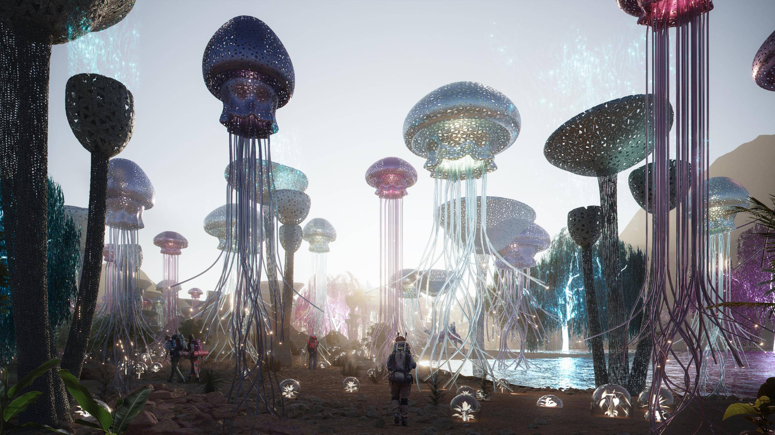
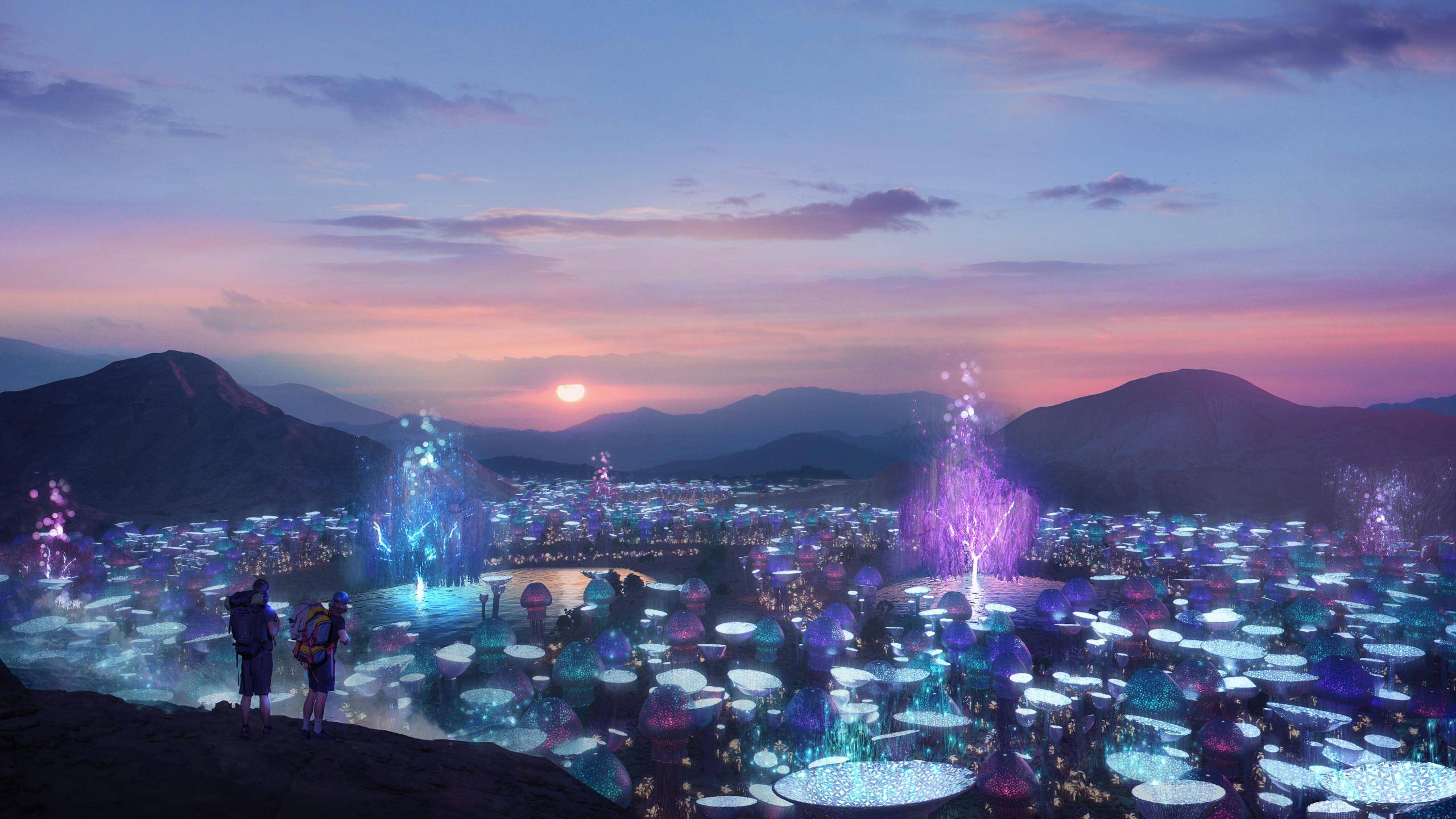
In this exclusive case study, we talk to Lemons Bucket about one of their more unusual commissions - a field of giant air-purifying mushrooms, trees and jellyfish!
Lemons Bucket is a Madrid-based multidisciplinary studio creating high-quality images that engage the emotions to convey their clients’ architectural design ideas. They have collaborated with international firms and participated in prestigious events such as the Rookie Awards and Madrid Design Festival.
The Project
As is so often the case in our line of work, the turnaround for this ambitious project was incredibly short. In fact, from start to finish the Lemons Bucket team had just 5 days to deliver the final visuals. To make things even more challenging, this was no ordinary architectural visualisation project, as Lemons Bucket explain:
"The idea was to introduce original elements that would serve to purify and clean the desert air. Our clients wanted to break with the normal look of traditional solar or wind farms and explore a more organic, natural and artistic concept. The final concept of the design is based on an interplay between the natural forms of trees, jellyfish, mushrooms and flowers."
The drawings below give us a sense of the ambition of this project. The air will flow through the bottom of the structures where it is purified before being released through the top. The drawing also reveals the grand scale of these unusual structures, which are an impressive 17 metres in height!
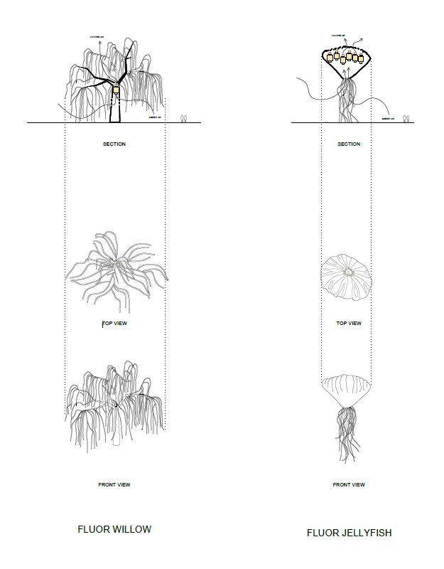
Technical diagram of air purifyers
Initial elements chosen by the client
As the concept wasn't finalised, the process of visualising the project became an essential part of the design process - moving in lockstep with decisions made by the client. Although several air purifier forms had originally been mooted, the initial images explored just one type - mushrooms.
With the short deadline and no models available from the client, the team faced a challenge: either model giant mushrooms themselves or source suitable existing models. As Lemons bucket explains:
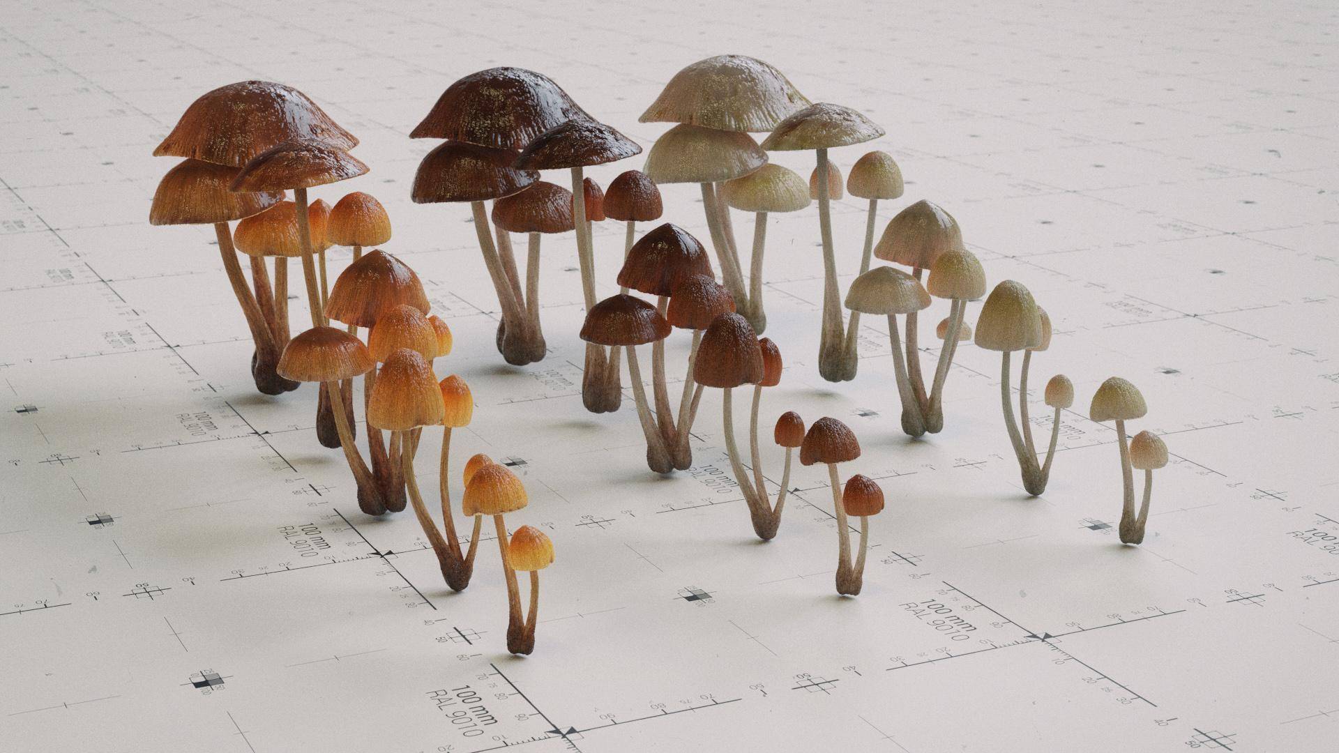
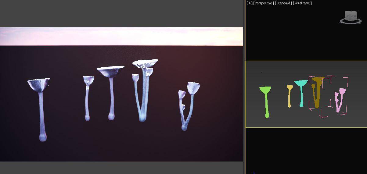
"After considering several design options, the mushroom shape was chosen to convey that organic feeling. Due to the short time to develop the project, 3D mushroom models were purchased from an online library and modified to suit our client's needs."
the image below shows several early material tests created by significantly modifying the shaders from the stock models.
First Drafts
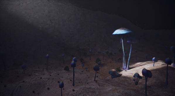
Once the models and shaders for the mushrooms had been improved, the next stage was to show the assets in context. At this point, the client was able to sign off on the designs and get a sense of how the lighting and composition would work as well as explore Initial ideas for choosing a camera angle.
Below you can see 6 of the early tests. showing a range of lighting scenarios and compositions. Although heavily altered along the way, you can clearly see how these early sketches contain the seeds of the final images.
![]()
![]()
![]()
![]()
![]()
New items added by the client
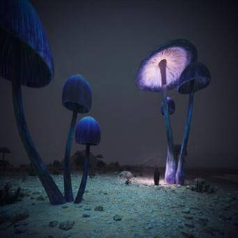
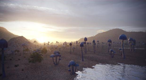
Having reviewed the initial sketches and realising that the concept was progressing successfully, the client made the decision to add additional forms to the "farm". Lemons Bucket explain:
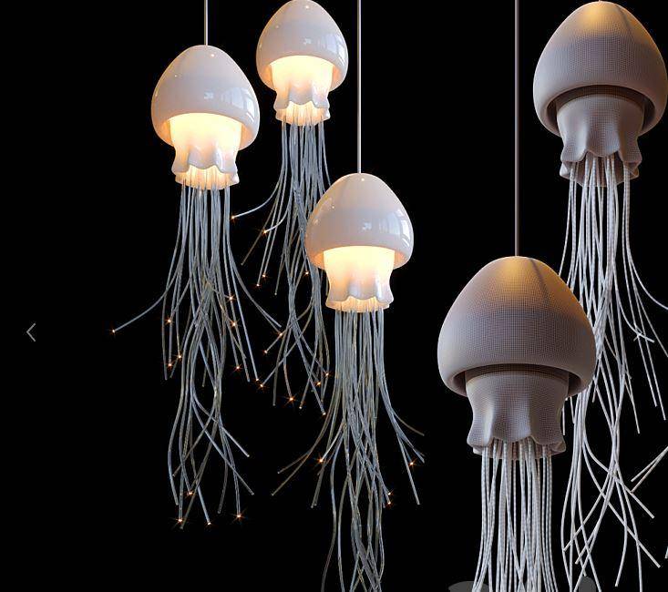
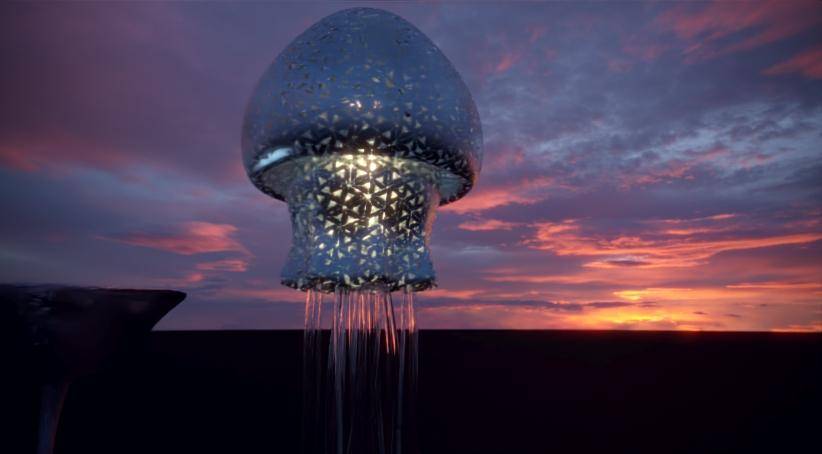
"After considering several possible new organic forms, it was decided to incorporate the "jellyfish". Once again we searched through existing libraries in the hunt for the perfect 3d model. This time we felt it made sense to look at existing fabricated jellyfish forms rather than using a realistic jellyfish model. In our search for designs inspired by jellyfish, we found a lamp by Vargov design that fitted the brief. With a suitable model acquired, we then proceeded to test various materials until we settled on a metallic finish, with a pattern that incorporates small triangular windows of glass that emit light."
The images below show the original model, followed by the model in context with the new radically altered shaders.
At this point, plant objects were also included to support the concept. Fortunately, these were much easier to source but were still subject to heavy modification to add lighting and shader effects.
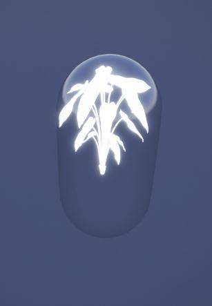
You can see these new assets in the tests below which included weeping willows of blue or pink light and flowers in glass spheres in addition to the mushrooms and jelly fish.
Forest elements for distribution
All these options were presented to the client. Based on their feedback, Lemons Bucket chose a modified version of the mushrooms with the caps facing upwards, the trees, the jellyfish, and glowing flowers encapsulated in glass for the final images.
Next step was to distribute them in the scene, as Lemons Bucket tell us:
"In a way, this was the least challenging part of the process. Having used Forest Pack for years on pretty much all of our projects, we knew that scattering a few thousand items while retaining a high level of artistic control wouldn't present any problems. Once we had sign-off on the assets from the client, the rest was plain sailing"
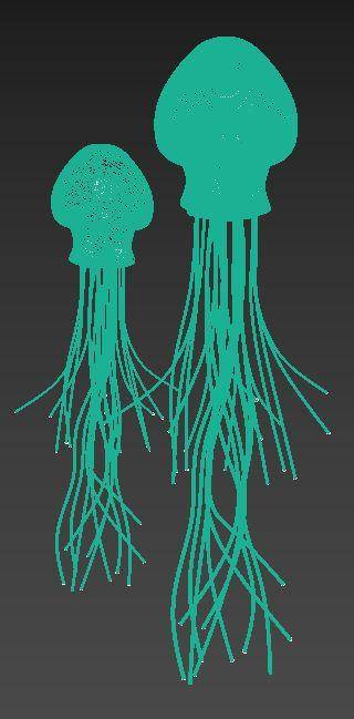
Below you can see the models that were scattered with Forest Pack to populate the scene with 1000s of air-purifying organic forms.
Distribution
With the final assets signed-of, Lemons Bucket could turn to Forest Pack for final layout and composition. They explain:
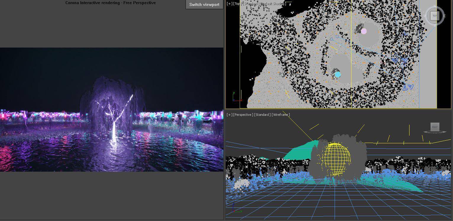
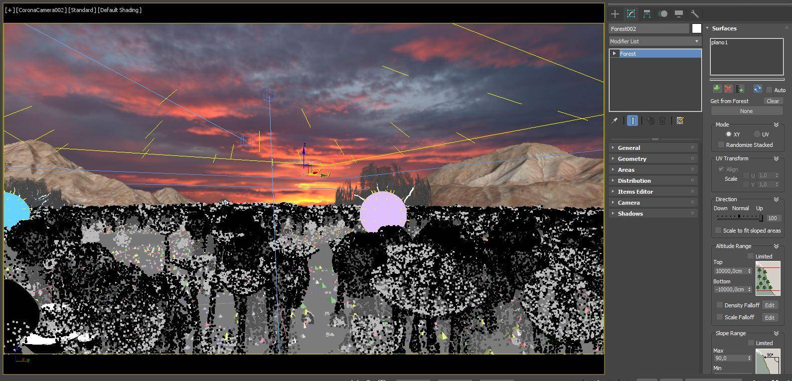
"Using Forest Pack it was simple to create the layout. There were two Forest Pack objects used to scatter the bulk of the assets. One was used to scatter the mushrooms and jellyfish, which were considered the main elements, and a second Forest Pack object was used for the trees and luminous flowers which we considered the secondary elements. In both cases, the distribution was achieved by using spline areas to define the areas, and the objects were then projected onto the terrain. The whole process was fast to set up and easy to iterate".
In the images below you can see screenshots showing the Forest objects in the viewport, as well as some of the settings that were used. 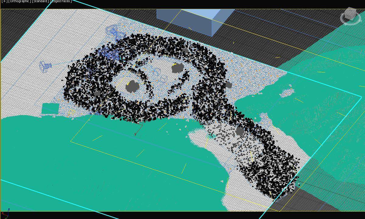
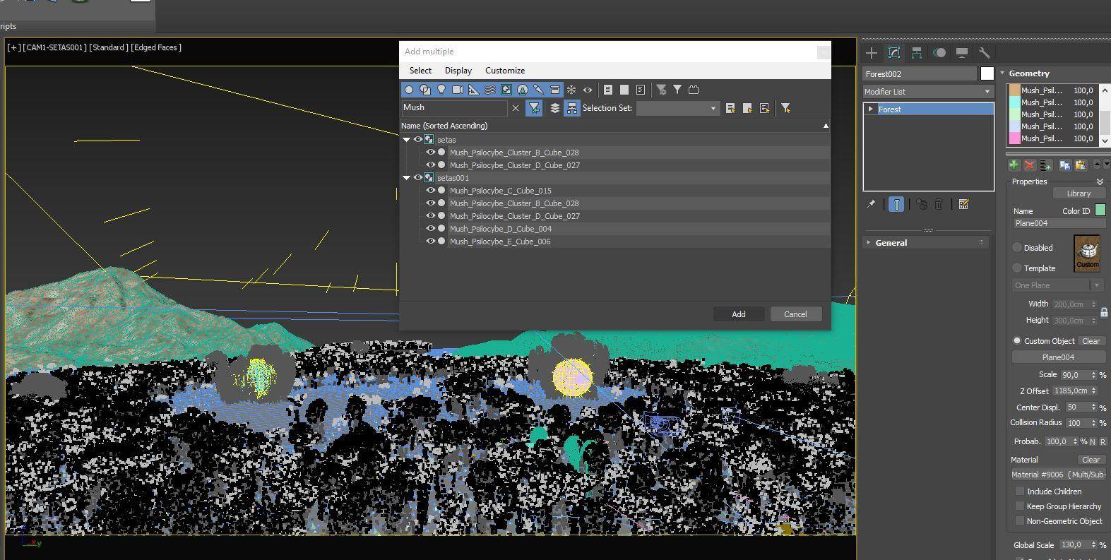


The post-production process.
Once the layout of the objects and the composition of the two final images were agreed upon by the clients, the image was rendered using Corona before moving to post-production.
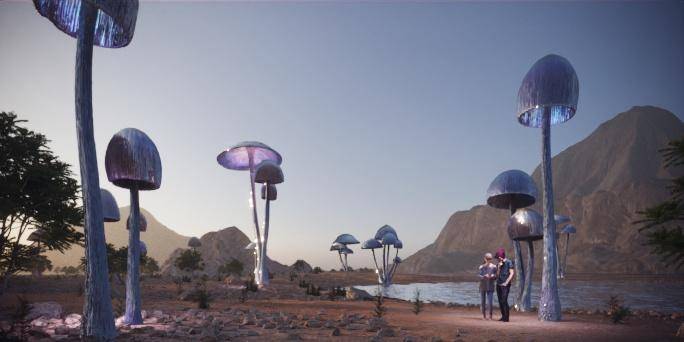
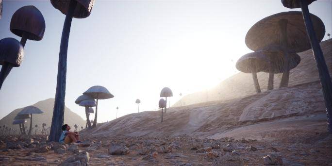
Colour correction was mainly limited to grading, enhancing the lighting, glare and atmospheric effects. Additional elements were also added at the point including rocks and other debris to increase ground clutter, plants in the foreground to help frame the view, and finally some human figures to improve storytelling and add a sense of scale. You can see a breakdown of the post-production process in the video below followed by the final renders.
We'd like to say a huge thanks to Lemons Bucket for sharing this unusual project with the iToo Software community.
