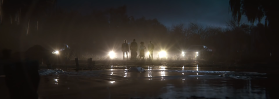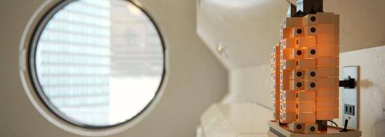

In our latest case study we talk to Beauty and the Bit about their recent architectural short film, how they used Forest Pack, and the importance of finding time for personal work.
Non-commercial projects are an essential part of Architectural Visualization. They allow artists to explore new techniques, improve skills, and scratch creative itches without having to cower in the shadows of client expectation. They’re not purely selfish though, more often than not, customers will benefit from the improved workflows, renewed motivations and creativity that springs from personal projects. Many offices know this and make time for their artists to Tell your accountants, unbillable time is not always time poorly spent!
Beauty and the Bit, a world-renowned architectural communication firm based in Madrid, recently spent quite a bit of their unbilled time creating Landmark, their first animated short film. The Studio was founded by architect and visualiser Victor Bonafonte along with Lina Garau as CFO. According to Victor, the studio’s guiding inspiration has always been “cinema, painting, traditional photography, videogames and concept art instead of architectural visualization”
This source of inspiration explains Landmark, which attempts to expand the possibilities for architectural filmmaking. Victor tells us: “it is a Project made with the intention of exploring other languages in architectural animation. It is our attempt to add emotional content, strong storytelling and art direction. We have tried to create a cinematographic experience, to show that a solid narrative is not at odds with architecture film.”
What is Landmark?
Victor is keen to stress that Landmark was intended “not an architecture, animation but an architecture movie.” An ambitious project, especially considering that this was the studios first serious short film. Victor tells us “We’ve made some previous architectural animations but nothing as ambitious as this project. It was entirely created in our offices and conceived as non-commercial. It has an indie approach since we didn´t want to have any artistic limitation. We were our own clients.”
Balancing opportunities and limitations
Elaborating on the studio's motivation for Landmark, Victor elaborates “we felt that sometimes architectural animations have no soul, they are more a descriptive but media with no emotional content. “We had grown tired of this, so we wanted to at least try something a bit different.” Of course, for all of the creative freedom offered by personal projects they come with two with two big limitations: time and money.
Beauty and the Bit are a busy and successful studio, any time spend on the project had to be spare time. As everyone in this industry knows, that is a rare commodity indeed!
Non-commercial projects are also just that – non-revenue generating. Expenses, therefore, need to be as low as possible, preferably zero.
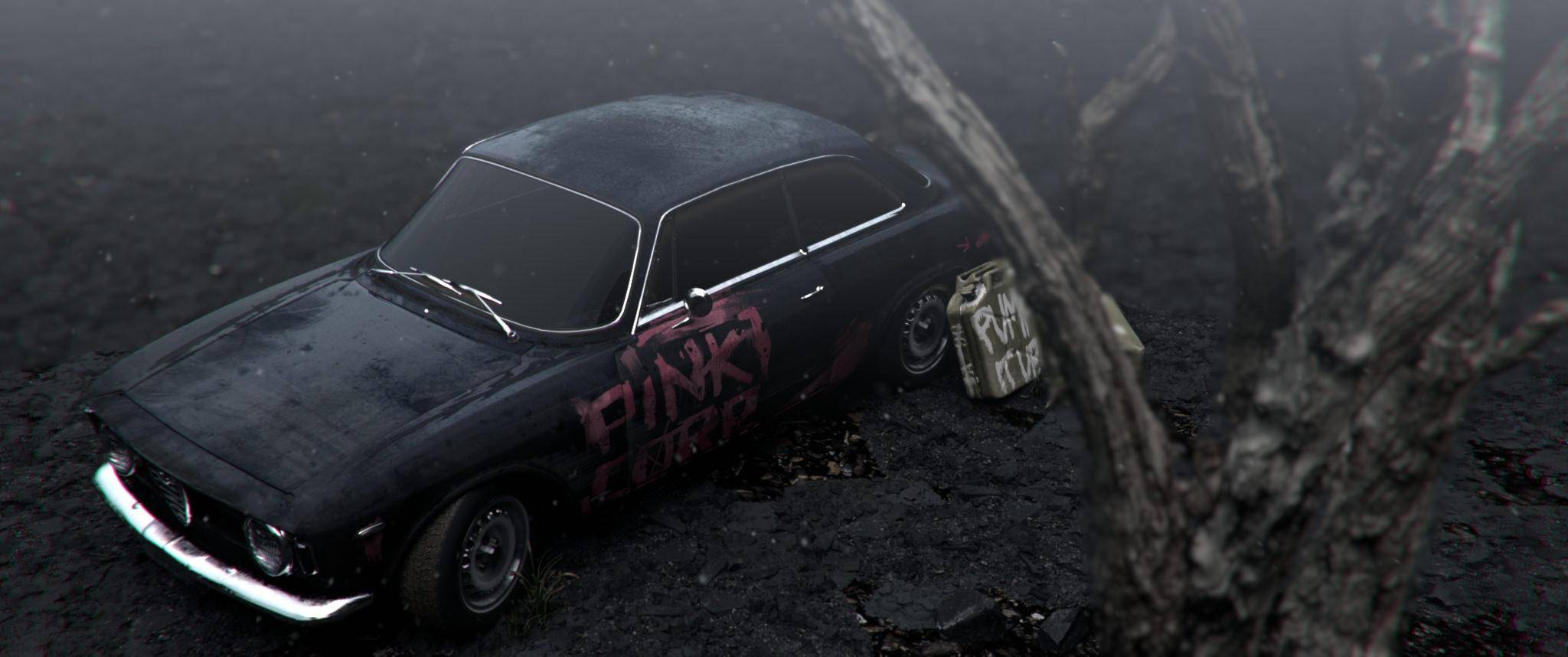
Despite these limitations, Victor talks about the project almost as though it was a necessity. “It’s a landmark in our career to, a summation of all the things that we value as important,” He tells us, “The process has been a rollercoaster but mainly a breath of fresh air. Sometimes we feel limited by the conflict between our art direction and client´s expectations… I guess this happens to everyone.
“It came at a moment in many artists careers in which one needs to take a step back, take some risks, do what you truly feel in your heart and re-invent your whole process.Landmark was the back door we used to unleash all our creativity at a certain point in time. Kind of our own secret lab.”
A part of that experimentation in the labs involved looking at how Forest Pack could be used to help create large-scale realism for the barren exteriors required for the film.
Forest Pack and Landmark
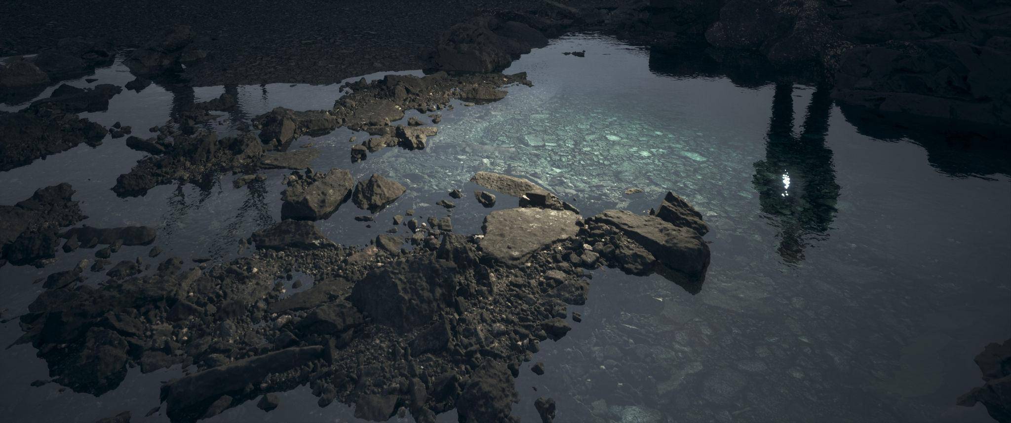
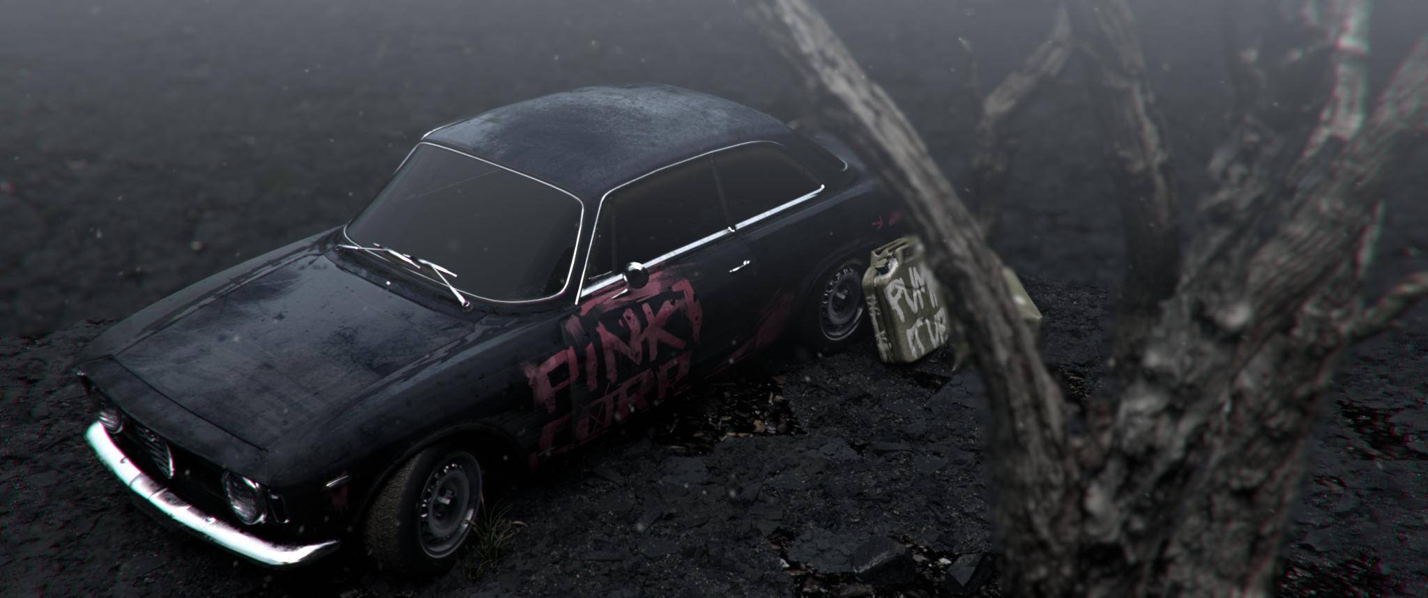
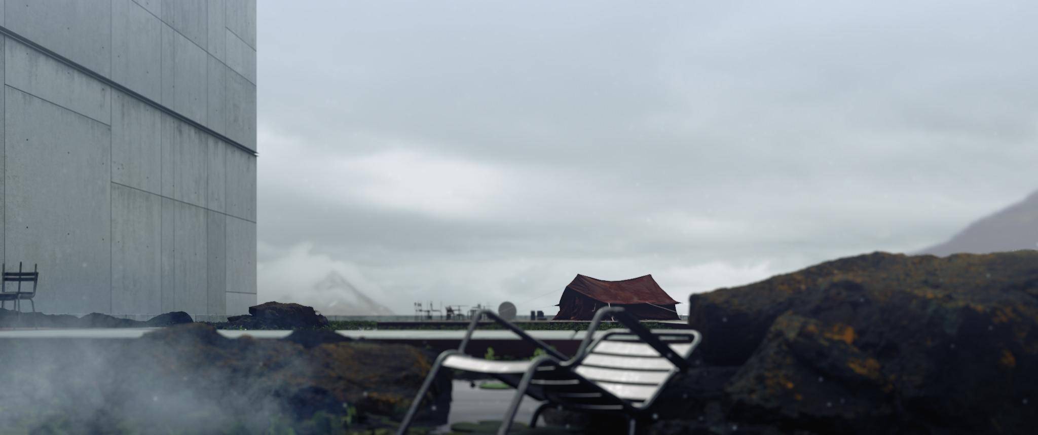
Any huge exterior environment needs good scattering tools. Forest Pack played an essential part in creating the environments. Despite its name Forest Pack is used for far more than trees, it was used extensively in Landmark to scatter thousands of rocks and other assets quickly and with a high degree of art-directable control.
“During the pre-production and production phases we used Forest Pack" Victos says, "in combination with Quixel Megascans scanned objects, to quickly populate the scene with rocks and other small assets without wasting an unnecessary amount of time.”
As we know times is one of the productions biggest limitation, but it’s not just speed that made Forest Pack an invaluable tool. he continues "it also helped us giving a more realistic and complex look to the shots and making decisions on the concepts and pre-viz stages, even if the scenes were really simple and rough. The general workflow when distributing assets with Forest Pack was to create 2 or 3 Forest objects with different kind of assets. Of course, we added additional variation by randomising their transforms (rotation and scale) as well as using different Density values and Distribution maps. Some of the distributions we used included random bands, spread, groups and others. This gave us a lot of control to create a very diverse look to the scene”.
In the short making-of video below you can see an example of one of the Forest objects used in the exteriors.
In addition, another interesting technique used in Landmark to add realism to the environments was projecting photos. This was used in combination with Forest Pack to scatter additional assets on top of the projections and help boost the sense of land relief and realism in the scenes. The following short video shows how this works.
Workflow: The bigger picture
Since this was an architectural movie, it seems logical that the workflow found in traditional filmmaking would be the best approach. Victor and his team followed a typical 3 part production pipeline:
Preproduction including all the planning, gathering of references, creating of concepts, storyboarding and previz. This stage also includes a preliminary version of the soundtrack.
Production including environment creation, architecture and assets modelling and texturing, overall scene creation making close reference to the previz, scene lighting and final rendering,
Postproduction including compositing, colour grading, final cuts and edit, and the soundtrack.
If you are interested in learning more about the production process, Beauty and the Bit have recorded a nearly 20-minute making-of video that explores these 3 phases in more detail, as well as providing a more thorough explanation about the motivation and creative impulses that helped shape the film.
To find out more about Forest Pack, visit the Product Page.
