Noticias
Lea los últimos desarrollos de ITOOSOFT
- Inicio
- Noticias
- Categoría: Casos prácticos
- Making of Container Harbor - by Bartek Muczyń
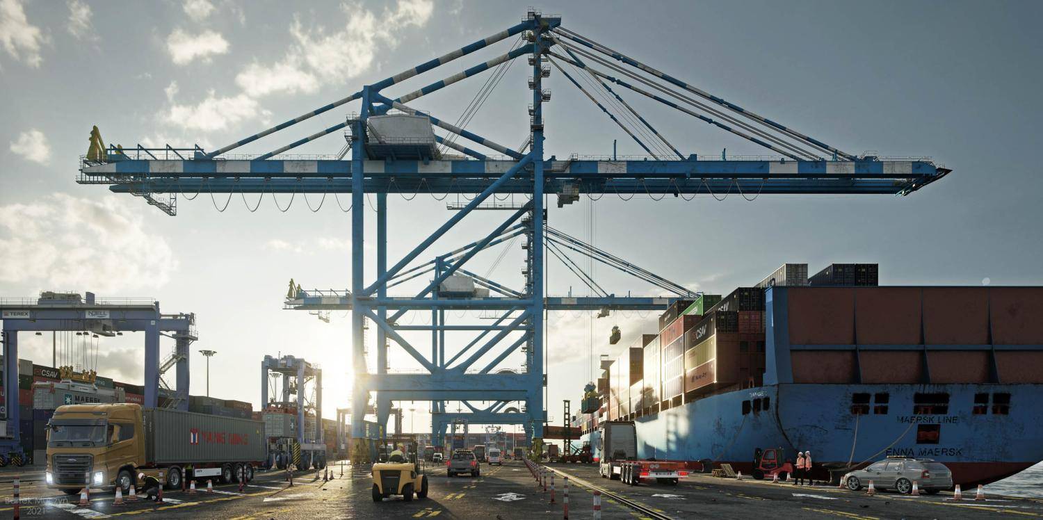
As soon as we saw the latest personal project by Polish artist Bartek Muczyń, we knew we wanted to learn more about how the fantastic realistic renders were achieved. Luckily for us, Bartek was kind enough to write this making-of article, sharing insights into how he created Container Harbour.
Introduction
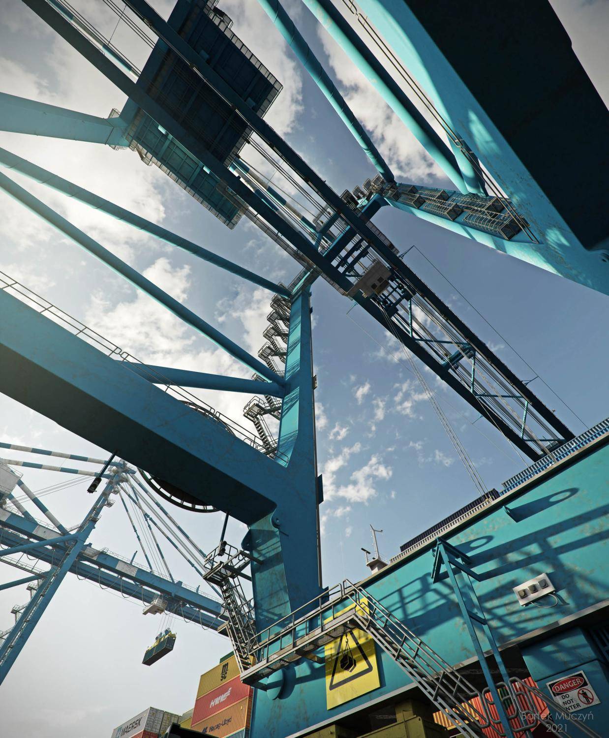
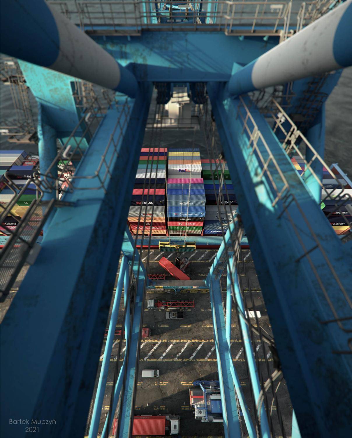
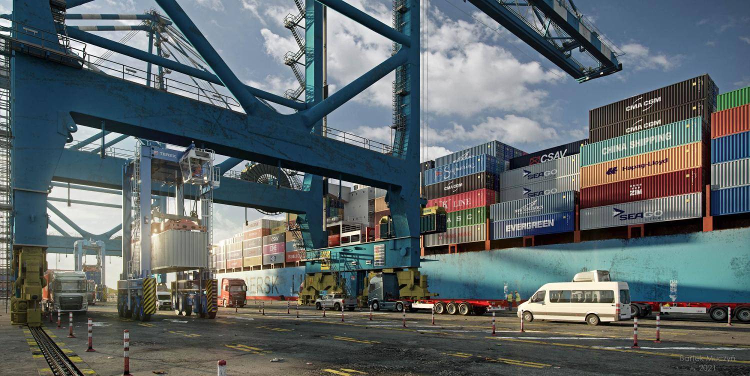
It's an honour to be published on the Itoo Software blog. It makes me very proud and excited to have the opportunity to tell you about my most recent personal project called "Container Harbour ". The idea for this project has been brewing for some time. The inspiration originally came from my girlfriend who works in a container terminal and I thought it would be a nice way to visually explain what an important and underestimated part of the industry it really is. Furthermore, there are lots of projects where foliage plays a major part, whereas industrial themes have been largely forgotten. Before I explain some of the processes of how it was made, let's start with the final images.
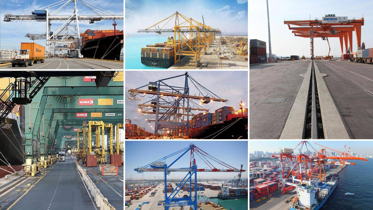
First of all, as everyone knows, a successful render always starts with researching high-quality references. In the composite below you will see just a few that informed this project.
3D Modelling
The entire scene is created in 3ds Max. Modelling was a pretty straightforward job, although I didn't model the cranes and vehicles because it would have taken me several weeks or even months to finish the project. To be honest, I don't think I'm good enough at vehicle modelling which when done well, is a highly specialised area of the industry. Instead of wasting time and risking very poor quality models, I decided to buy them from a 3D marketplace.
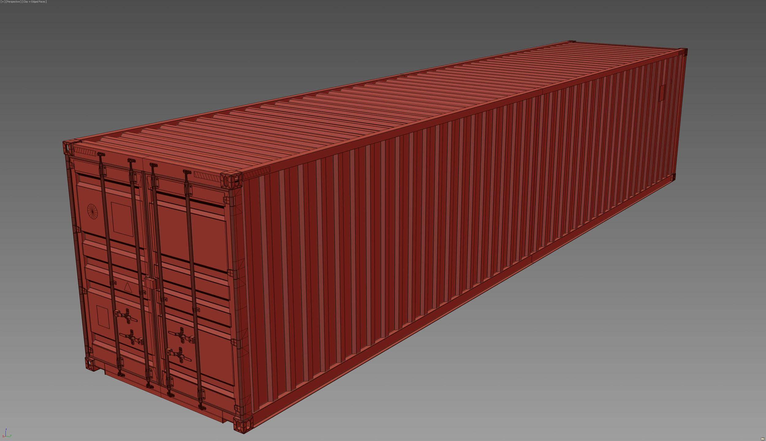
The most enjoyable part of the modelling process was preparing the assets. I had a nice pack of references and re-creating the look was an enjoyable task. In general, building the main scene wasn't difficult because I had a clear vision for the final outcome. When I work on a project, I will set up cameras and at the end of each stage, to prepare previews and see the progress. Thanks to this strategy I can easily see which parts of the image I should pay more attention to. The ship along with all the other non-purchased assets are made using traditional poly modelling techniques inside 3ds Max, no external 3D applications were used. Here are some images of the finished models and scene.


Scene Layout
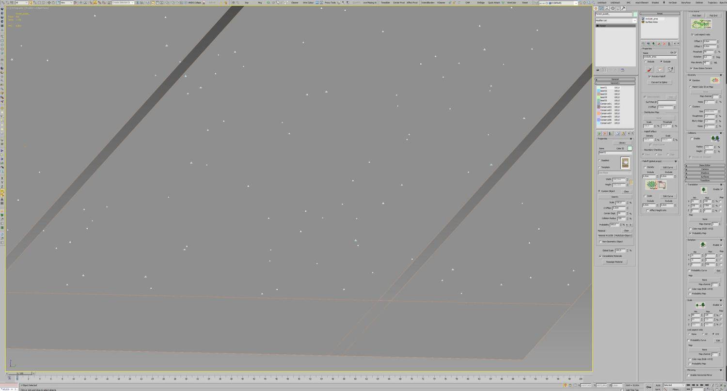
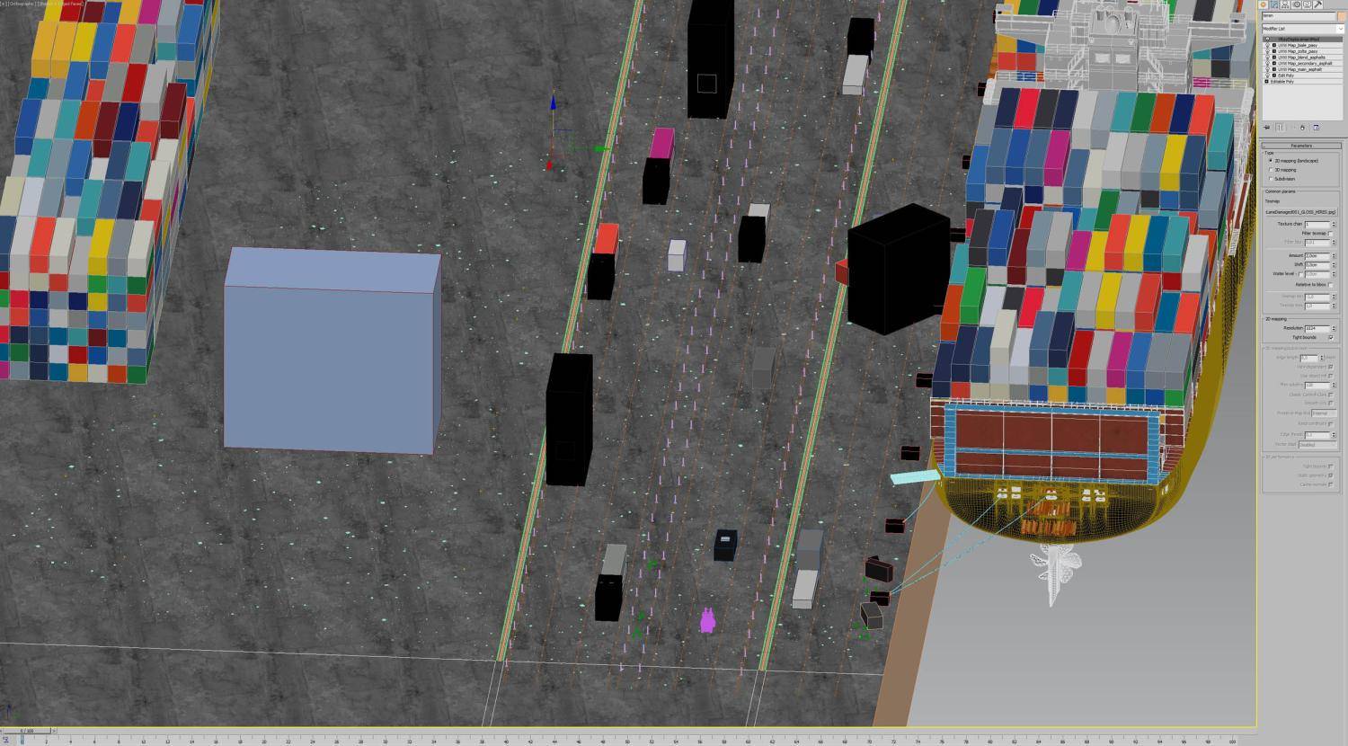
Often the realism of scenes can be let down if they look too tidy. One trick to create a realistic scene is the addition of small amounts of detritus of a type that's suitable for the environment. In a normal foliage-heavy scene, this would normally involve adding leaves, twigs and other kinds of litterfall. In this industrial scene, it means garbage! I used a large pack of pre modelled garbage and simply scattered them with Forest Pack Pro using simple settings, almost the default parameters in fact.
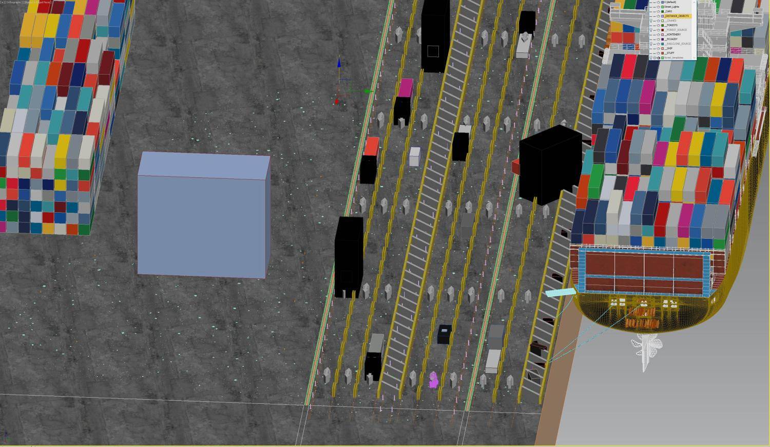
I also used RailClone Pro for laying out several key parts of the scene, including the bollards, reflective markings on the roads (using V-Ray Distance Textures) and the tracks underneath the cranes. As you can see from the screen captures below, the setup was very simple. Just a spline and evenly distributed source objects.


For stacking the containers I used the Z Stacker node, which is one of the built-in RailClone macros. Achieving the proper results was just a case of some tweaking and experimenting. To make it faster to set up I initially just used a simple box with the container's dimensions in RailClone. After testing until I got the desired stack volume, I then swapped the box for the high-resolution source objects. There are about 33 containers, all with different shaders. I didn't use one container and different materials, because each one of the containers had its own multi-material.


RailClone Pro and Forest Pack Pro give me enormous flexibility and the possibility to tweak my scenes on the fly, without destroying my workflow. For example – scattering using traditional methods was a huge disadvantage compared with Forest and RaliClone – in order to change any composition you wanted to make, you would need to delete scattered assets manually and do it all over again! It is inefficient, annoying and frustrating. ForestPack and Railclone on the other hand, require only a few parameters changes, maybe a spline adjustment and that's it! :
Textures and Materials
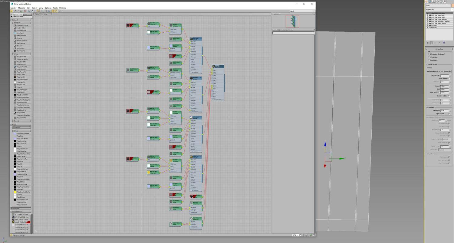
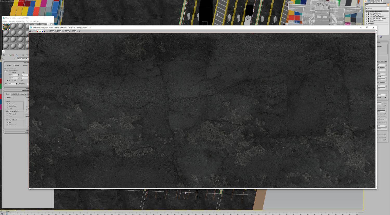
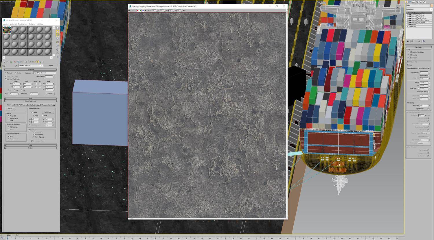
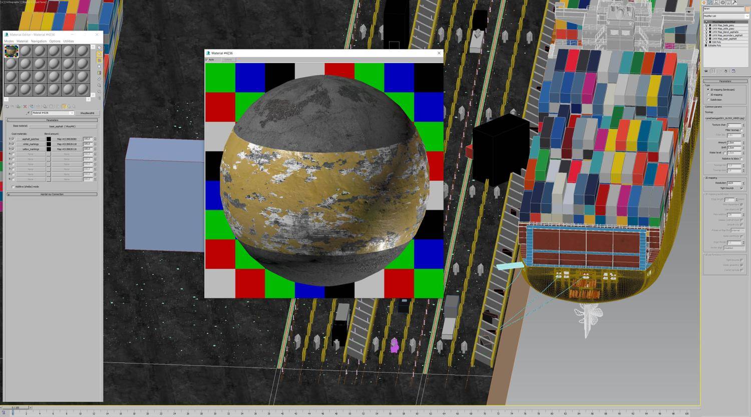
Texturing and shading was very satisfying and enjoyable work. I mixed simple texturing inside 3ds Max using its own tools with Substance Painter. For example – the ground is fully textured in 3ds Max, using several Poliigon and Textures.com assets, because of its size. It was impossible to create a single map with a good enough pixel density in Substance Painter, even with the recently added support for 8K maps. The main shot was just too close to the ground. For the ground final shader I used 4 different materials: base asphalt, worn and cracked asphalt, yellow asphalt for yellow markings and white asphalt for white markings. All of them composited using a VrayBlendMaterial. Road markings were added with a VrayDistanceTexture using a RailClone object to generate the mask.
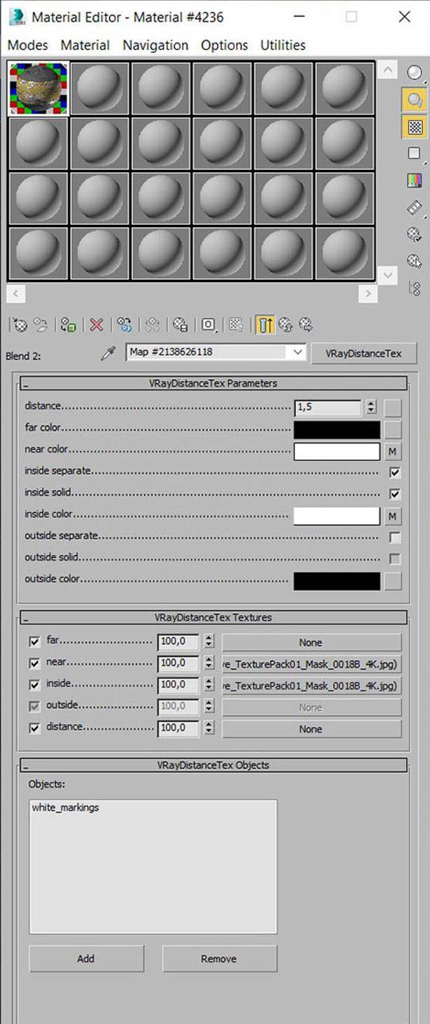
The rest of the assets were textured using Substance Painter.


The container ship on the other hand combined both approaches, mixing together Substance Painter and 3ds Max textures. The base maps for colour, specular and normal are a texture from Substance, but the markings, ship name and other signage was done using VrayBlendMaterial and VrayDistanceTexture, because it was easier and faster to achieve the desired effect.
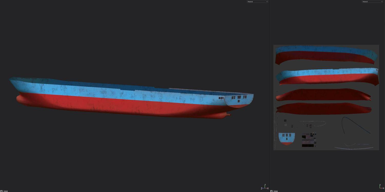
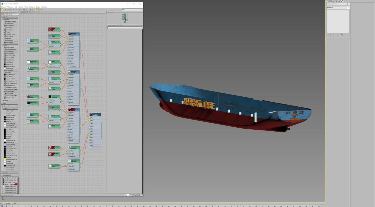
Lighing
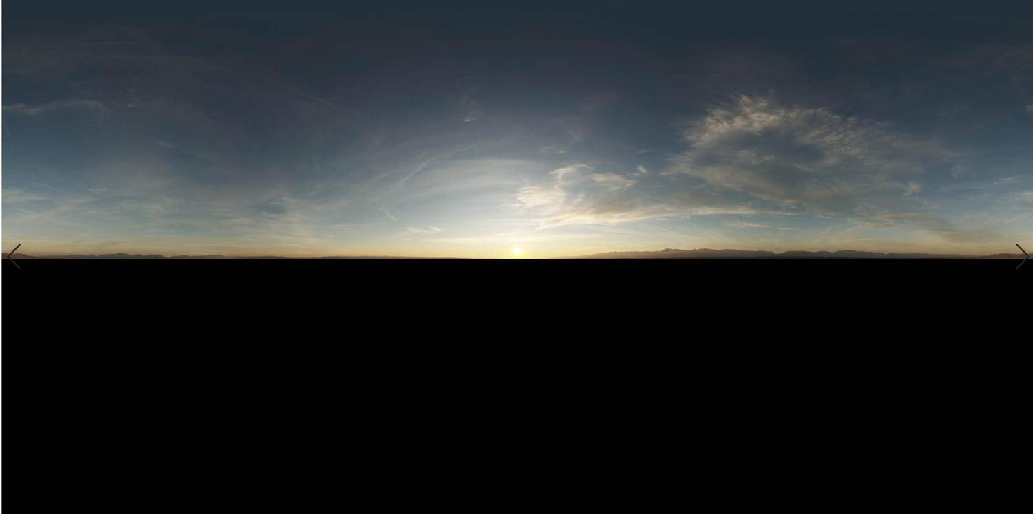
My renderer of choice is always V-Ray. I've been working with it since version 1.39. It is incredibly fast, reliable and very flexible. It is also capable of very realistic results. This project was rendered with V-Ray NEXT. Since the beginning, I knew that I wanted my project to be as realistic as possible, so lighting solutions like V-Ray Sun are not good enough. Instead, I chose an HDRI setup using ( in my opinion) the best HDRIs on the market by 3DCollective. For the light source, I used a Vray Dome Light with a pretty standard setup. I was satisfied with the effect so I could proceed to other camera angles.
![An overview of the ground material An overview of the ground material]()
![]()
![Several object being used with V-Ray Distance texture as a mask. Several object being used with V-Ray Distance texture as a mask.]()
Rendering
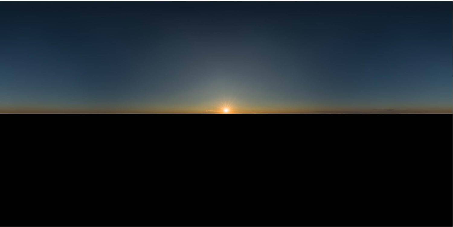
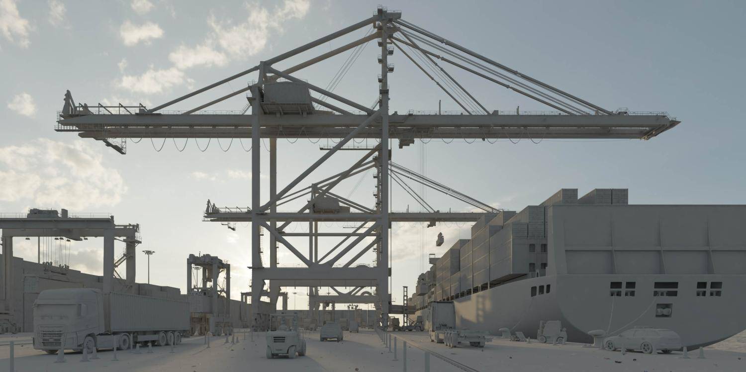
The final resolution of the rendered images was 5K. Because of the HDRI light setup in my scenes, the render settings had to be cranked up a bit to eliminate noise problems. Luckily my computer is very powerful, so I didn't have to worry too much about rendering times. On average it took 6 minutes to render 5K image in a very high-quality setup. You can see my render settings in the image below. 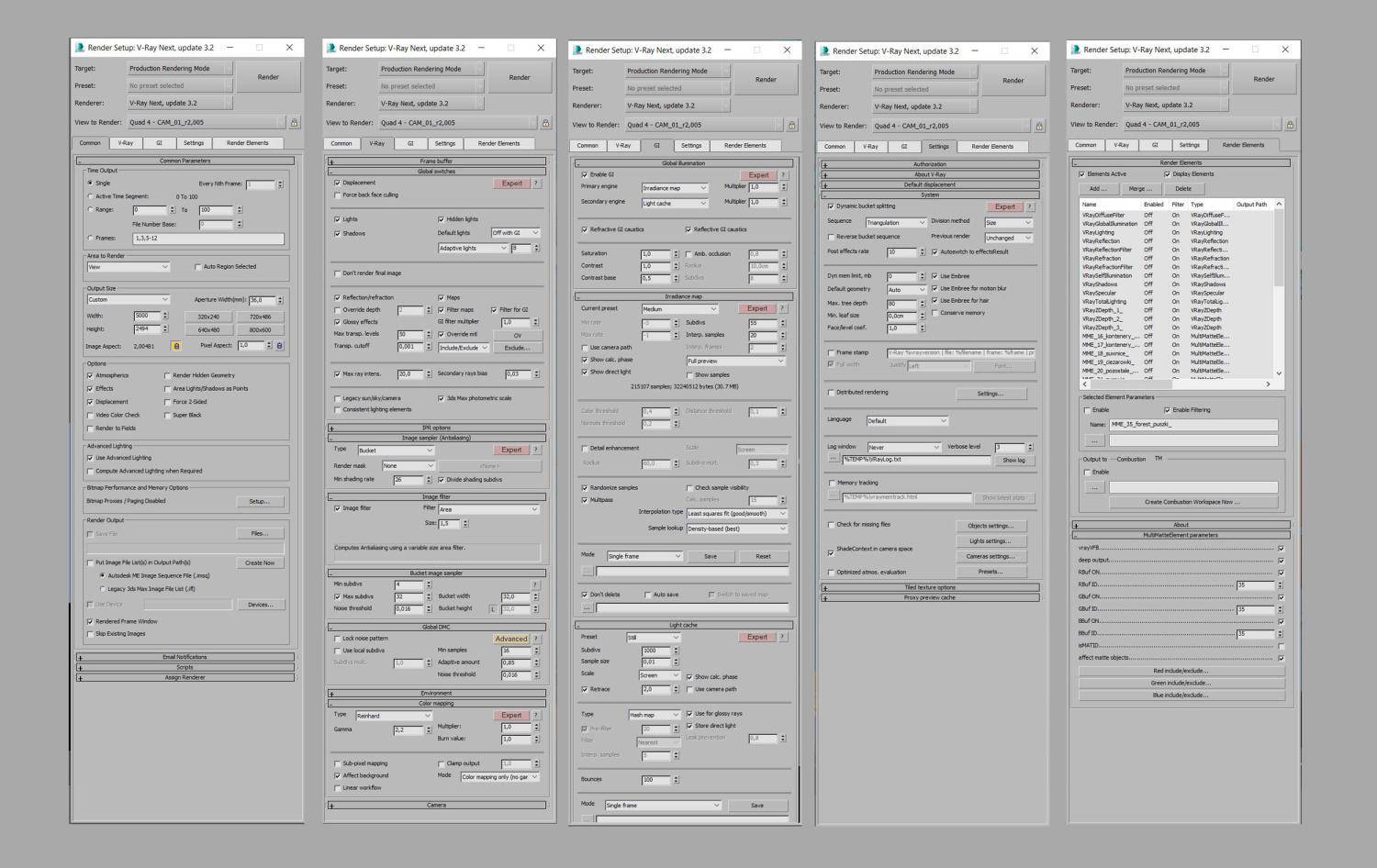
I rendered the usual base render channels for use in compositing and post-production with lots of multimatte elements for masking. I prefer to have different type of objects on different multimatte elements, for future post-production. I try to avoid different types of assets on the same mask because it is difficult to extract the wanted one during post. For example – cars were separated on one mask, technical vehicles on other, cranes on their own mask and so on,
Post Production
The post-production stage was very straightforward. No fancy plugins have been used, just basic colour corrections, compositing render passes and some photos for effects and cutout people. I like my images to be contrasted and clean. I used to do bleached images in the past and was wondering why they aren't even close to realism. One of my secret ingredients is reading the histogram of the image, to see if it's underexposed, overexposed or exposed correctly. You can see an overview of my postproduction steps in the GIF below.

Final Comments
I hope you enjoyed learning a bit about my image creation process. In my opinion, each element during the process is extremely important starting with the crucial first step of collecting a good amount of reference images before you start on your project. Geometry, shaders and textures, lighting...all of them create the proper mood, make the image whole and tell the story, which at the end we want to do.
